


When choosing a product that you are not familiar with, the first thing we use to gauge its quality of the label. The first impression of the product does a lot when it comes to persuading you to purchase it. So it is very important to spend a lot of time and effort on creating the right labels.
Check the form of text that appears on the label. There is only a small window of time for the text to attract a potential customer so you should have an easy to read font style and size. The brand name should be clearly visible with a short description that gives an accurate picture of a brand to someone who has never heard of it. You can get the advice of label printing companies when it comes to the design as they have a lot of experience with a variety of labels. You have to practice the less is more approach when it comes to creating a description for the brand or product. It is best to use a font that is not a standard so that its uniqueness catches the attention of a passer-by. But you should always consider the readability of the font. There has to be a good balance between text and images. There has to be high quality when it comes to image printing which will elevate the brand. The quality of the labels and packaging all has a direct impact on how a brand is perceived. When the labels are printed in a poor quality, it will do more harm than good to the brand even if you are saving from the printing cost.
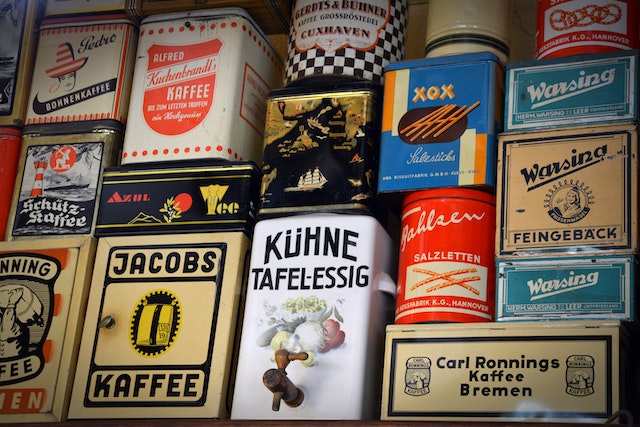
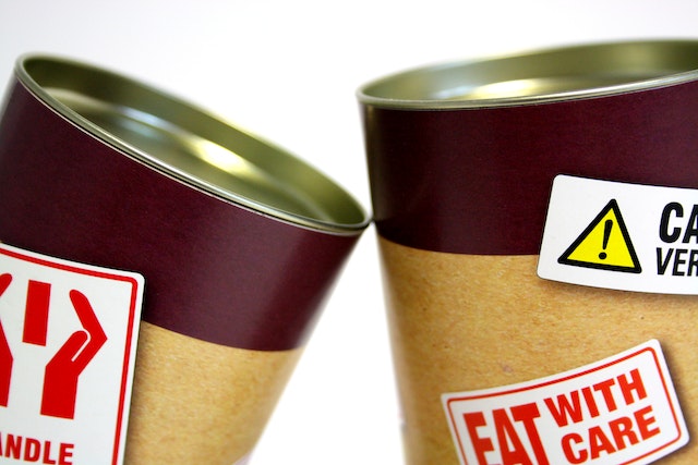
Consider the materials you use for the labels. This is the first thing you should select before starting the design. Consider the type of paper used, its thickness and texture. You can use transparent paper or an opaque paper. Different finishes of the material can also create more interest. Colours are very important when it comes to defining a brand and catching the eye of a potential customer. There is a happy medium between not enough colour and too much colour. When there is too much colour, it can be chaotic and the customer will not know where to look. You have to research colour psychology and how people perceive colour to understand which colours are best suited for the label.
While the label design doesn’t have to be the same as the packaging, there has to be a relationship between the two. There are many innovative software options you can use to experiment with colour combinations. Colour will be the first thing that grabs the attention of the shopper with text following a close second. So it is crucial that you get the right combination and give the right idea about the company with the colours you choose. And you have to be consistent with the colour you use with your brand so that a customer who has seen the label before will be able to recognise it in a different product item.